
01
Naming
The company is The Knowledge Company — definite article, three initial capitals. After a first full mention in running copy, “the Knowledge Company” is fine. Product surfaces are proper nouns and take capitals too: Claim Register, Knowledge Dictionary, Founder’s Note.
Correct
The Knowledge Company
the Knowledge Company
Claim Register
Knowledge Dictionary
Avoid
Knowledge Co.
TKC
KnowledgeCompany
knowledge company
02
Lockup
The isotype, a hairline rule, and the wordmark. This is the default — reach for it wherever there is room. Do not rebuild it with your own spacing, rule, or type.

03
Isotype
A sail that is also a book. Use it on its own only where the name already appears in the same field of view, or where the space is too small or too square for the lockup — avatars, app tiles, favicons, watermarks.

04
Wordmark
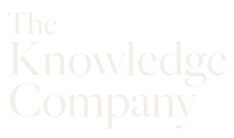
Set in Cormorant Garamond and supplied as artwork, not as live text. Use it where a mark would compete with surrounding imagery, or in single-colour print. Never re-set the name yourself.

05
Clear space
Clear space is one third of the isotype’s height, measured on all four sides. Nothing enters it — no type, rule, image edge, or button. Below the minimum sizes the book inside the sail stops resolving, so use the isotype or the wordmark alone instead of shrinking the lockup.

Dashed line marks the minimum clear space
Asset
On screen
In print
Lockup
160 px wide
32 mm
Isotype
24 px wide
8 mm
Wordmark
120 px wide
25 mm
06
Colour
Ink and parchment carry the brand. Fresh, signal and stale are status colours: each one says something specific about the state of a claim, so never reach for them decoratively.
Ink
Primary background
#0A0908 rgb(10, 9, 8)
Surface
Raised panels and cards
#121212 rgb(18, 18, 18)
Parchment
Primary text and reversed marks
#F3EFE8 rgb(243, 239, 232)
Fresh
Verified — checked and current
#6FBF95 rgb(111, 191, 149)
Signal
Needs review — due a check
#C8763A rgb(200, 118, 58)
Stale
Outdated — known to be wrong
#D65F4E rgb(214, 95, 78)
07
Typography
Nothing on the site uses a face outside this set. If a layout seems to need a fourth, it needs a different layout.
Aa
Cormorant Garamond
Wordmark only
Regular 400. Never used for headings, body, or UI.
Aa
Inter
Headings and body
Medium 500 for headings, Regular 400 for body. Tracking −0.022em at display sizes, −0.0125em for text.
Aa
Inter
Labels and data
Medium 500, sentence case, 12px, tracking 0. Timestamps, identifiers, register rows.
08
Misuse
Everything below has happened to a logo at some point. None of it needs to happen to this one.
Colour
Don’t recolour the marks. The two supplied variants are the whole set.
Effects
Don’t add a shadow, glow, gradient, outline, or bevel.
Proportion
Don’t stretch, squash, rotate, or shear. Scale both axes together.
Construction
Don’t rebuild the lockup with your own spacing, rule, or type.
Contrast
Don’t drop a mark onto a busy photograph without a solid plate behind it.
Meaning
Don’t use the marks to imply an endorsement, partnership, or certification that doesn’t exist.
Send the layout over before it ships. We would far rather spend two minutes on a mock-up than find the mark stretched across a conference banner.